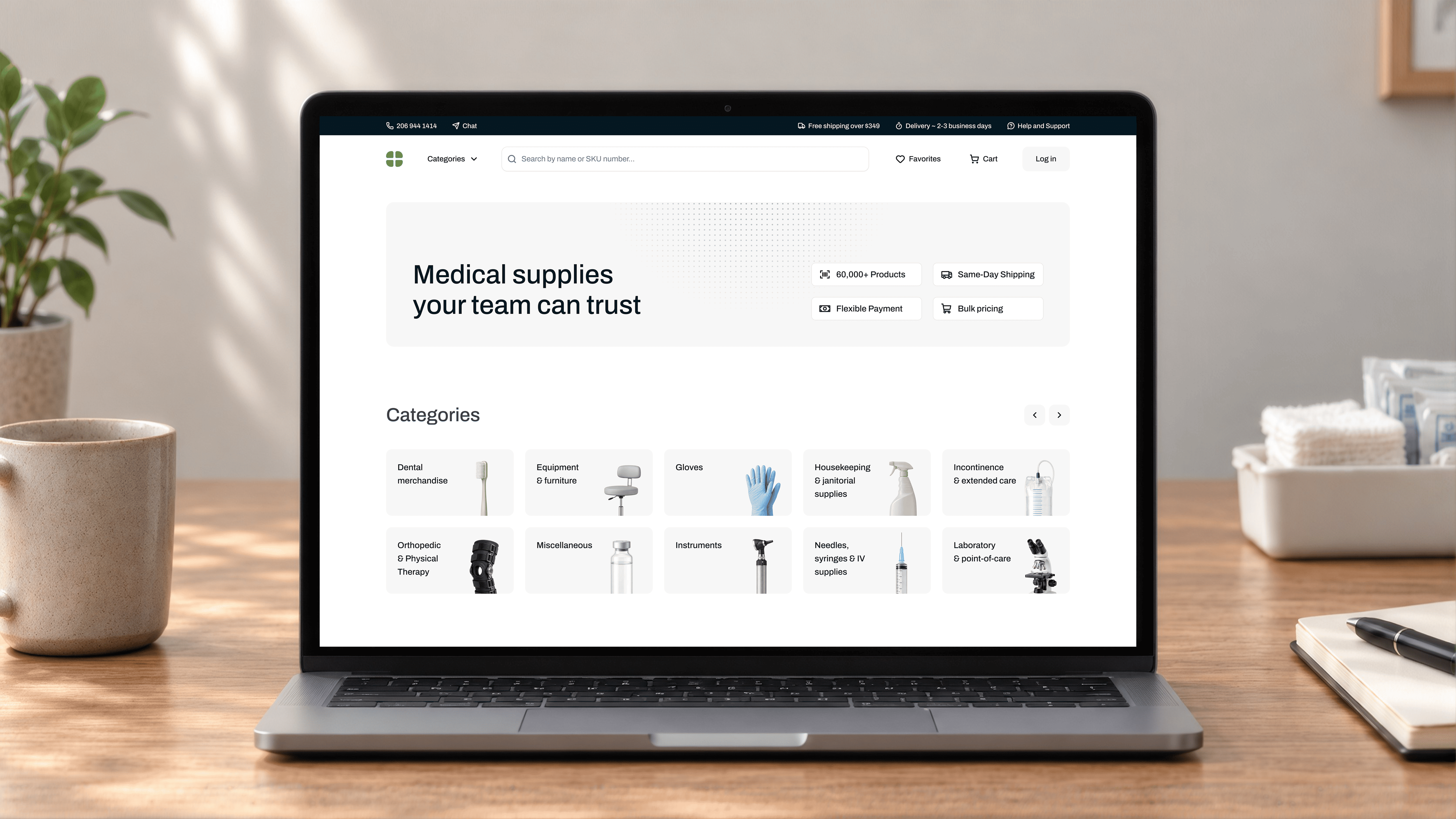
Trustworthy is an easy word to put in a brief. Designing an experience that actually earns that feeling is much harder. That tension became central in a recent healthcare commerce project.
The product helped clinics and medical professionals purchase the supplies they rely on every day. Behind the familiar goals of better conversion, fewer returns, and a smoother path to checkout was a broader ambition: make the whole experience feel dependable. Become the third tab open.
That is exactly the kind of ambition we like to work on at Zypsy: turning a vague brand quality into a concrete product question. What has to be true, screen by screen, for someone to buy without stopping to second-guess what they are seeing?
Complexity has to live somewhere
Under the surface, medical supply commerce is complicated. Tens of thousands of products. Multiple variants. Medical licenses. Manufacturer-direct shipping. Different purchasing paths. Some orders end in checkout; others continue with sales.
We had roughly two weeks of focused research before design work needed to move forward, so cataloging every exception was never realistic.
Instead, we used a simpler test:
Does the customer need to understand this in order to make the right decision? If yes, it belonged in the experience. If not, the system should carry the burden.
That rule became surprisingly useful throughout the project.
Make the scale understandable
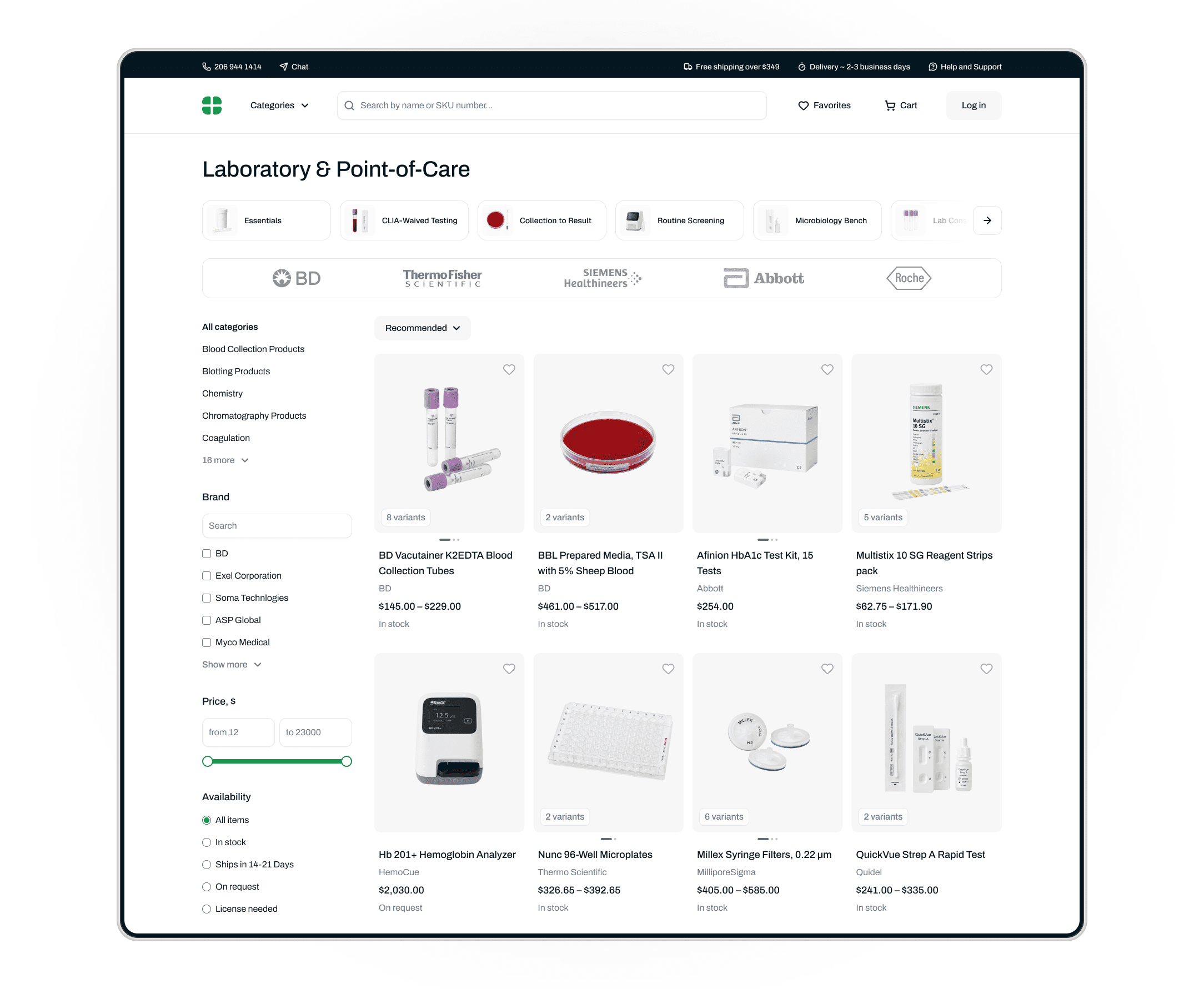
The breadth of the catalog was one of the project’s biggest strengths. It is also difficult to communicate. A professional buyer rarely comes looking for “medical supplies” in the abstract. They need nitrile gloves today, a particular diagnostic accessory next week, and something identified only by a manufacturer SKU after that.
So the catalog had to work less like a showroom and more like a well-organized stockroom.
We made categories much more visible and gave navigation enough depth to expose the depth of the inventory without requiring customers to understand how the catalog was structured internally.
But breadth only becomes an advantage when people can see their way through it.
Remove uncertainty at the moment it matters
One research finding was particularly concrete: customers were returning orders because they had bought the wrong product variant.
On mobile, the existing selector was easy to miss. That mattered because many customers were purchasing from phones, sometimes while moving around a clinic, checking a product against a label or SKU.
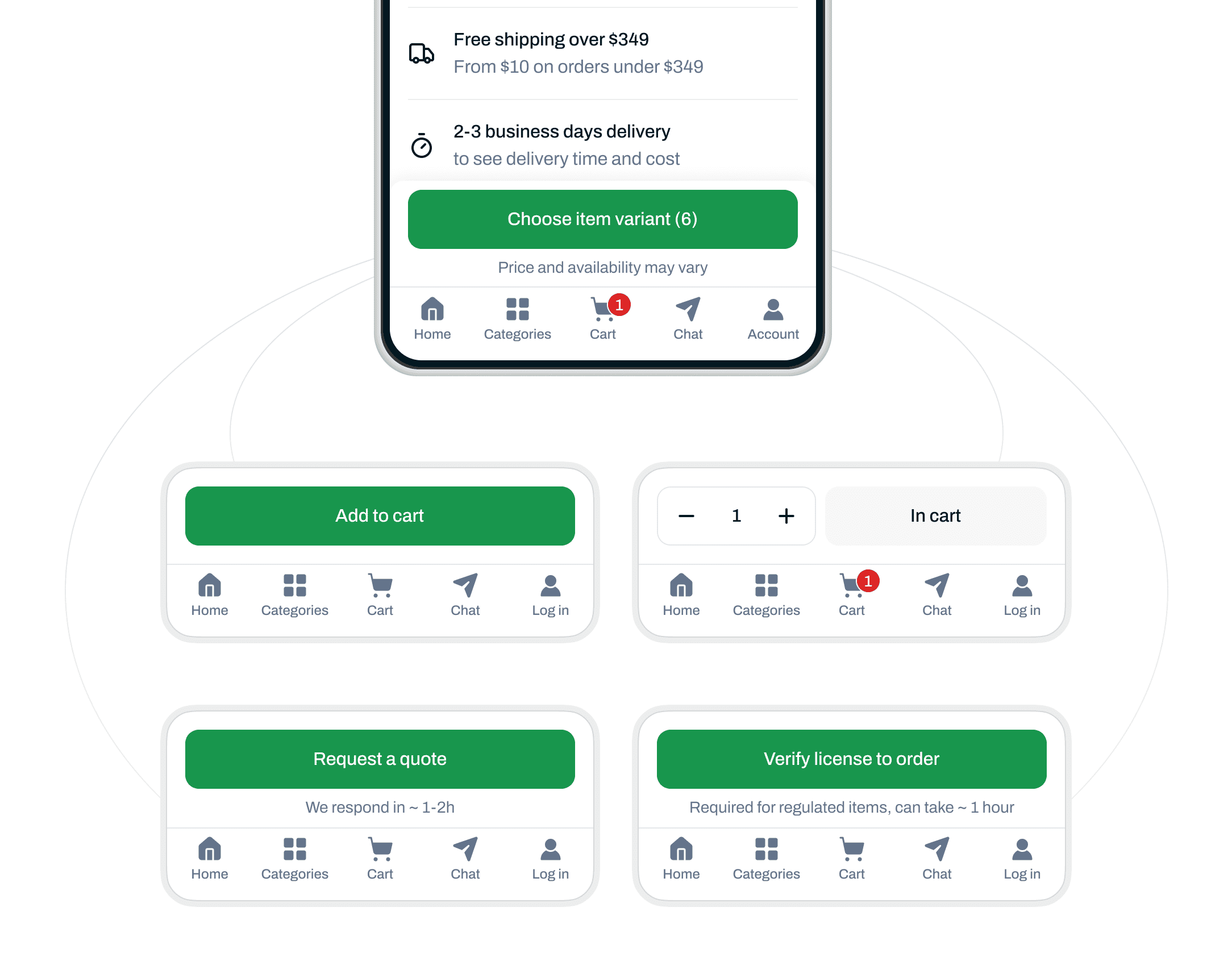
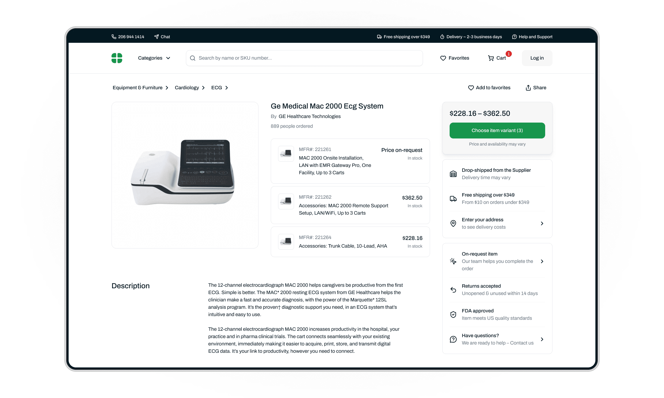
We pulled variant selection directly into the purchase flow and made it difficult to treat as secondary information. From there, the action area could adapt to the product itself. One item could go straight into the cart. Another could require a license. A third might need a conversation with sales. The interface changed with the rule, so the buyer didn’t have to memorize it.
Transparency without turning the page into a manual
Nobody buying an MRI machine expects it to arrive tomorrow. For less obvious products, expectations are much easier to get wrong.
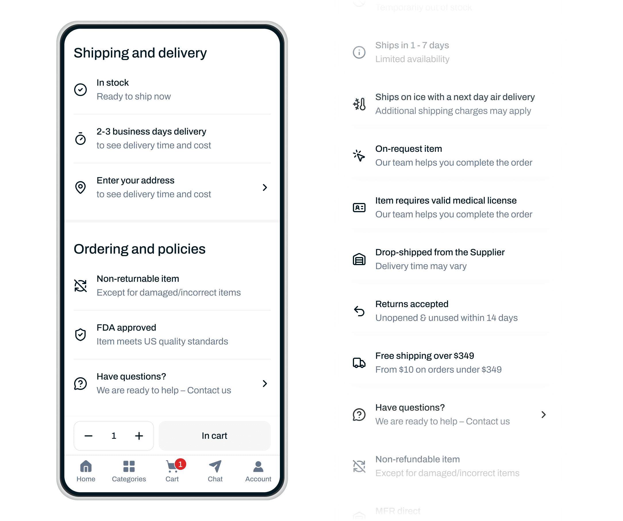
Medical suppliers sell items with different delivery windows, manufacturer-direct fulfillment, return restrictions and purchasing requirements. A buyer shouldn’t need to know the operational reason behind each one. They do need to know the consequences before ordering.
So rather than compressing those details into increasingly dense copy, we gave product conditions their own visual language. The page could stay scannable without becoming vague, which is a much harder balance than simply removing information.
Design for behavior, not breakpoints
We kept coming back to two very different purchasing situations. In one, someone is walking around a clinic with a phone, checking what needs to be reordered. In the other, a buyer is sitting at a desk with a larger order, several products to compare and much more information visible at once.
Those are not simply the mobile and desktop versions of the same screen. The desktop PDP therefore uses its extra space deliberately: visuals on the left, variants in the middle, purchasing actions and conditions on the right.
The information density changes. The underlying logic doesn’t.
Trust doesn’t stop at checkout
Checkout ends the transaction. But it doesn’t end the buyer’s job. The questions change as soon as someone pays.
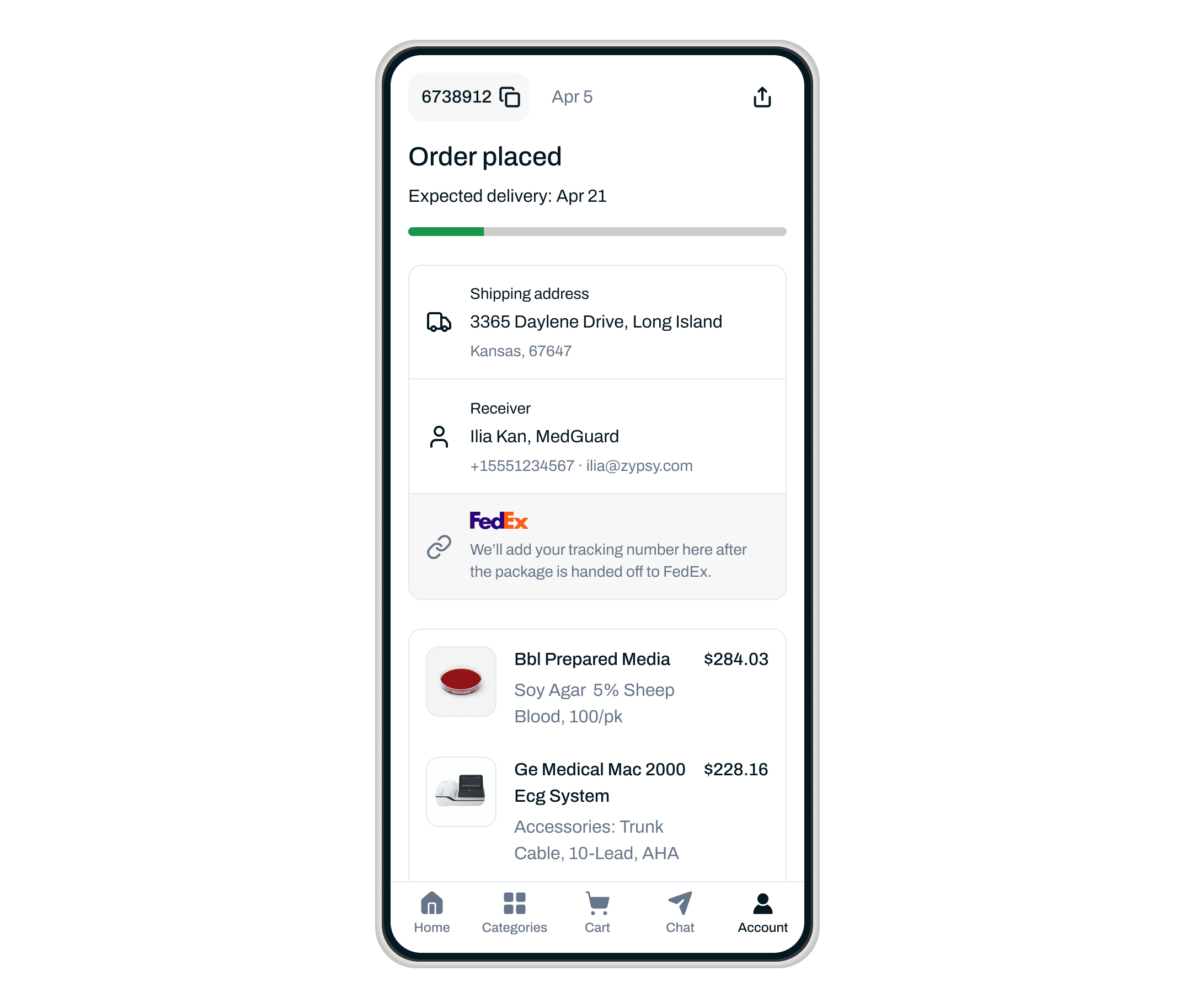
Did the order go through? Has it shipped? Is everything arriving together? When should I expect it?
For a professional buyer, these are not really post-purchase questions. They are part of the same job: making sure the clinic has what it needs. We brought active orders into the homepage and account through compact status cards, so customers could see what was happening without opening an order history and hunting for it.
In the end, trust wasn’t something we could add to the interface. It was something we could stop taking away.
Every unclear variant, hidden condition or uncertain next step gave the buyer another reason to hesitate. So the work became less about making the interface feel trustworthy, and more about removing those moments one by one.
The business underneath stayed complex. The experience didn’t have to. When there is nothing left to second-guess, trust has room to happen.