Was your feed flooded with critiques when Instagram changed its typographic logo in early August? Ours was. And FWIW, we agreed with many of the critics.
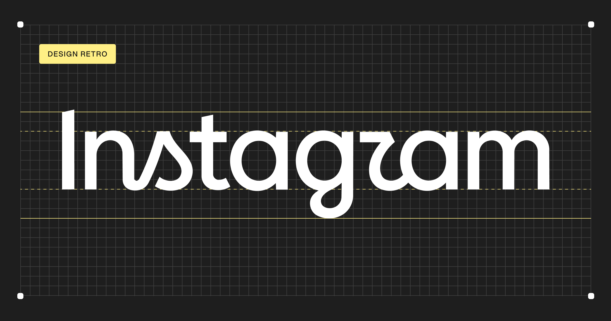
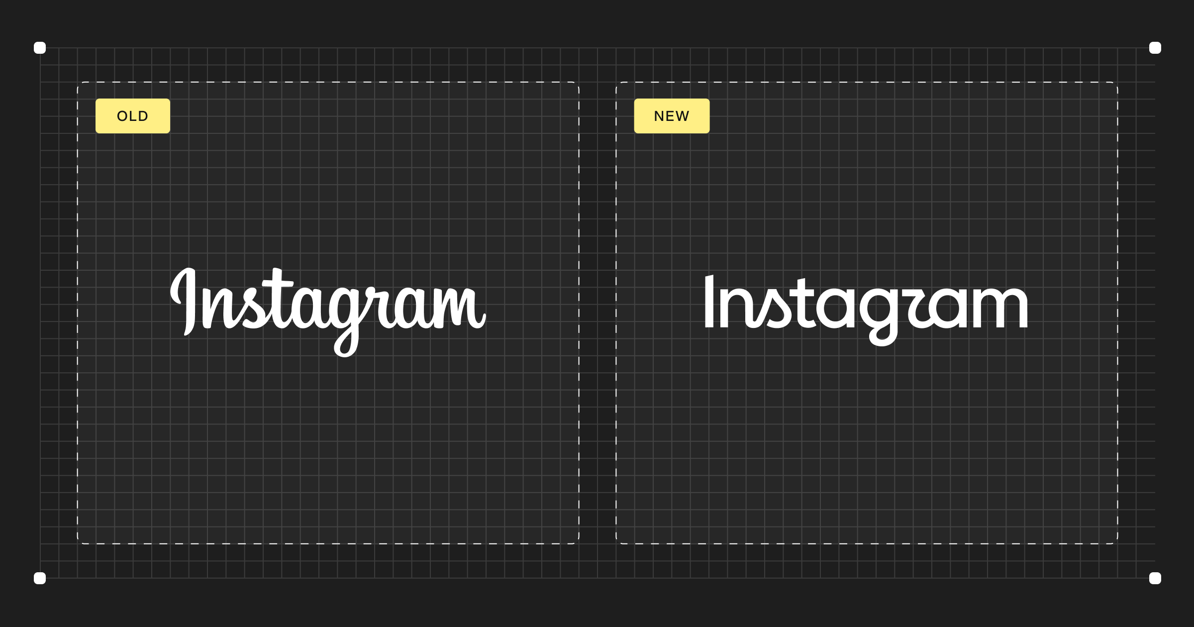
For years, Instagram used a looping cursive script in its logo. But with this recent change, the brand replaced its old typeface with a logo featuring a part-modern, part-script font. And the end result led many people to read the logo as “Instagzam.”
That misread in and of itself says a lot about the quality of the design, which we’ll discuss. But there’s also a worthwhile lesson in the decisions that went into creating this logo.
Let’s get into it.
The friction points: Typography
If you look at this logo for a moment, you can see that the letters don’t know what they’re doing. The N and the S are connected but no other letters are.
Why doesn’t the G connect to the R? Visually, it feels like it wants to. And if it did, it would help the R actually look like an R (instead of the Z many folks see).
That’s not the only issue with that problematic G, either. The loop below it feels too short and compressed relative to the rest of the word. If it was extended and connected to the R, the whole middle of the word would immediately feel more resolved.
All those details are part of what makes typography difficult. It’s not about drawing individual letters that look nice: it’s about designing a system of shapes that work together as a word. The proportions, spacing, stroke endings, and overall rhythm of the word all need to work together. And in this logo, those decisions just don’t feel resolved.
These might sound like diminutive details, but that’s essentially what typography is. And when enough of them are wrong, people start reading the wrong letters.
The traction points: Brand recognition
We’ve laid out some of the main typographic issues. But do they actually matter?
Instagram is one of the most recognizable brands in the world. We all know the word says Instagram before we’ve even read it. The brand could probably make half the letters illegible and people would still understand what they were looking at.
Instagram is big enough to get away with a badly drawn wordmark. So in some ways, the strength of the brand hides the problem.
What about the old logo?
It’s worth noting that Instagram never had a particularly good wordmark. The previous one was essentially an off-the-shelf script font. And for years, it did the job.
The old wordmark had this fluid, continuous script quality that was already strongly associated with Instagram. The brand could’ve taken that basic DNA and reinterpreted it as a more contemporary monoline wordmark, while still feeling recognizably Instagram.
There are plenty of examples of modern wordmarks that do exactly that. Lilly medical is an example of one. But instead, Instagram went in a different direction.
Who actually made this?
At first glance, Zypsy’s design team assumed Instagram’s new logo was likely created internally by their product design team. Why? It had the feeling of something produced by people who are very good at designing digital products, but who aren’t necessarily specialists in typography.
As it turns out, Instagram’s own product design team worked alongside several agencies on the refresh. According to Variety, there was “a very wide span of consulted and approving partners.” Instagram’s director of product design noted their goal was to create something that felt familiar to Instagram, but with a sharper, more modern style.
Of course, we don’t know who drew which part, what was changed internally, or what happened during the approval process. But we do know what eventually shipped, and that it reads as “Instagzam” to a lot of people.
What we learned: Specialist craft still matters
This new wordmark didn’t come from a tiny startup working with limited resources. It came from Instagram, one of the largest brands in the world, with access to some of the best designers and agencies. And that’s what makes the end result so strange.
Regardless of the low quality typography in its new wordmark, Instagram will be fine. The brand is so big and recognizable that it can afford to get something like this wrong. It’s a luxury most companies can’t afford, but this one certainly can.
The larger lesson this all points to is about specialist craft. Being a great product designer doesn’t make you a great typographer. Being a great brand designer doesn’t necessarily make you one either. And having more designers involved doesn’t solve that problem. What solves it is finding the right designer for the job.
We send a bimonthly newsletter on branding and design.
Subscribe on Substack.