TypeSafe.ai is getting a lot of attention right now because of its new AI model, Jev. The model stands out among the AI crowd because it doesn’t produce natural language text, it cannot hallucinate, and it’s much faster and cheaper than many existing LLMs.
Sounds like a company working on the cutting edge of technology, right? But something interesting happens when you go to this AI lab’s website. It looks like Windows 95.
Now, that aesthetic isn’t necessarily a bad thing. Retrofuturism (aka a movement that emphasizes depictions of the future as produced in earlier eras) has been creeping into tech for a while. And there’s nothing wrong with using references from older technology. The problem with TypeSafe is that it’s not clear why it should look like this.
Our theory? Like Patagonia quarter zips, this embrace of the retrofuturism aesthetic is another Silicon Valley trend.
The friction points: There’s a logo but is there a brand?
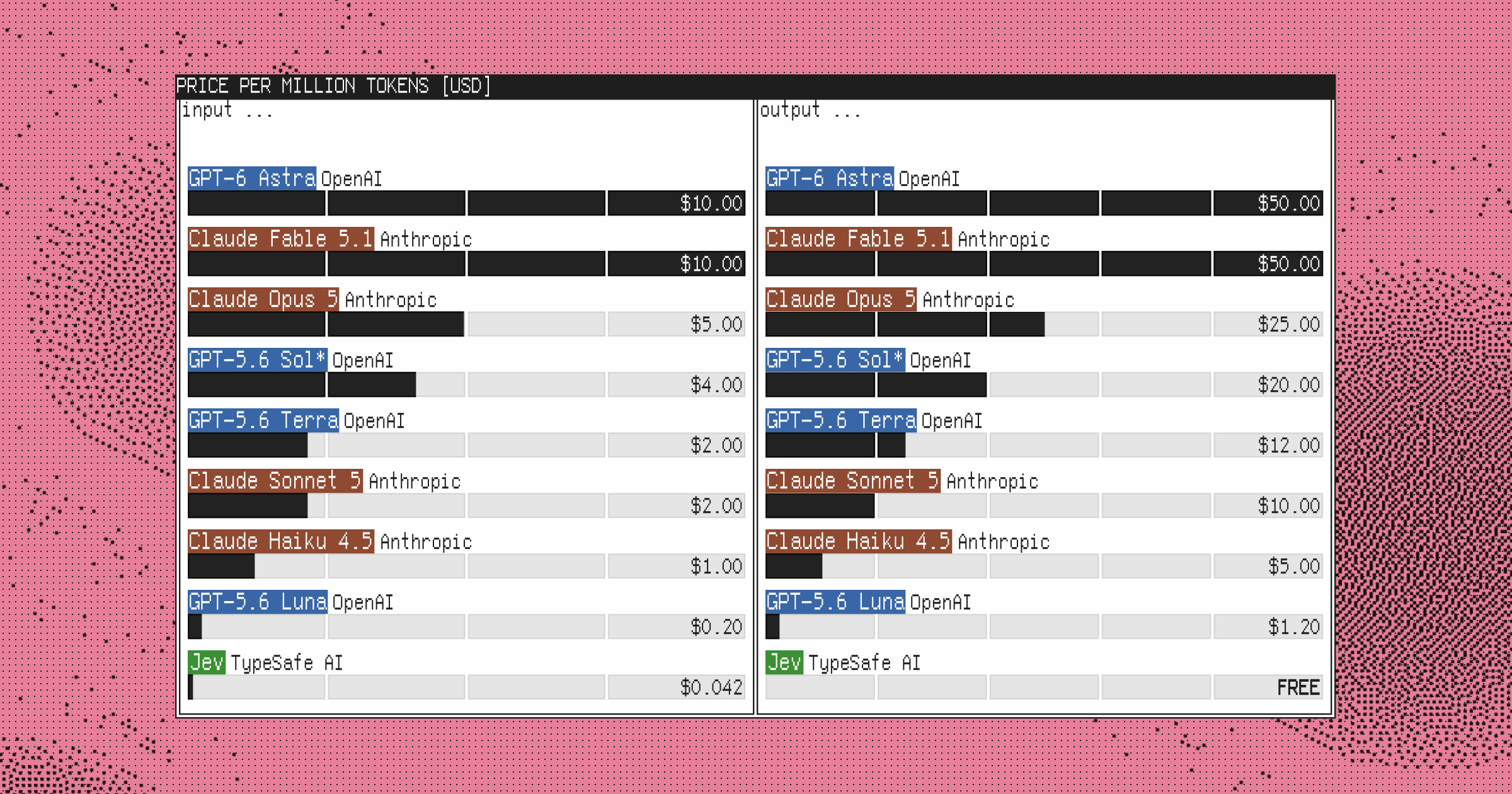
TypeSafe’s website is by no means terrible or offensive. But visually, everything about it screams nineties and noughties.
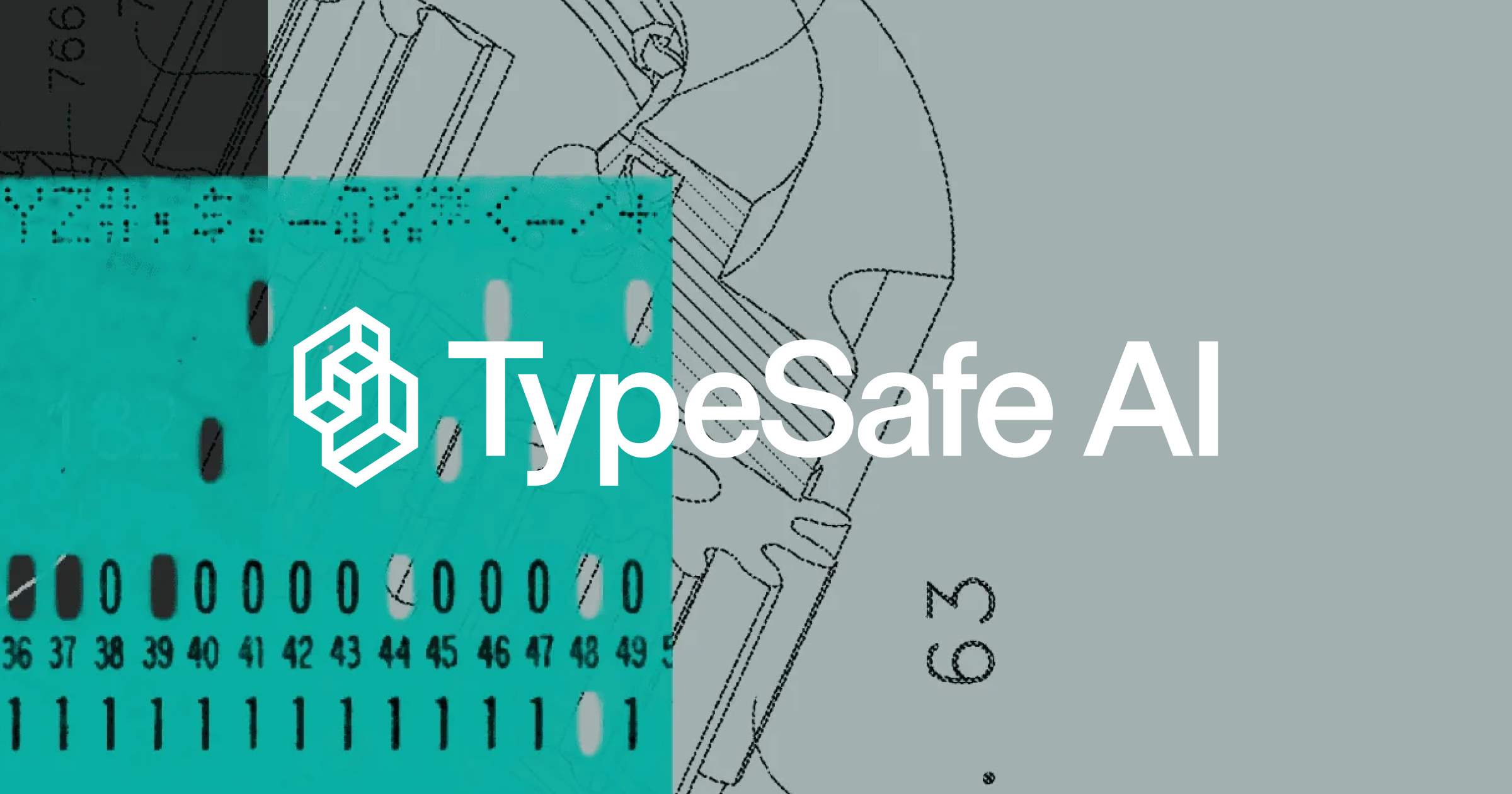
There’s a TypeSafe logo and around that you have Windows 95 style windows and old computer references. Then when you go into the manifesto page, there are scanned textures and physical material being brought into the digital work, which feels much more like the late 90s or early 2000s. The logo itself doesn’t really relate to any of that. It feels like the logo is one thing and the rest of the site is a look and feel that’s been added around it.
The problem is, that’s not really a brand. A logo is obviously part of a brand, but having a logo doesn’t mean you have a brand.
What’s the difference between the two? Seth Godin has a widely cited example about what defines a brand versus a logo. He proposed that if you had to visualize a hotel designed by Nike, you could probably see it pretty clearly: the materials, the signage, the furniture. But if you had to imagine a sneaker designed by Hyatt, there’s very little to work with. Because Nike has a strong brand and Hyatt just has a logo.
A brand is recognizable anywhere. It should capture the company’s identity so clearly that whatever the context, it still feels unmistakably like that company. The problem with TypeSafe is that the logo is clear and the aesthetic is clear but what connects them isn’t.
Why does an advanced AI company want to look like 1995?
TypeSafe is presenting itself as a company working at the edge of AI research. So why does the brand want its audience thinking about Windows 95?
There might be a good reason. If there is some relationship between what TypeSafe is building and an earlier period of computing, then that could be an interesting connection to learn about. But it’s not visible in what the company is currently showing. Right now, the design feels much more like a reaction to what came immediately before it.
For the last few years, AI companies all wanted glowing lines, gradients, and vaguely futuristic graphics. Zypsy actually had many clients asking for exactly that. The problem was, they didn’t really have a brand idea. They just knew they’d seen other AI companies looking that way and they wanted something similar.
A year later, the references have changed and now everyone wants the aesthetic of old computers. It’s the same problem, with a different look.
TypeSafe actually has something better to work with
An interesting part of TypeSafe is that the company itself sounds much more distinctive than the branding. Their homepage talks about building a new class of AI models and the bottom of their manifesto page reads “We’re Building Prod, Not God.”
TypeSafe seems to have a specific point of view about what AI models should be doing and how they should interact with software. And that gives a designer something to work with.
You could start with what makes TypeSafe different and build out from there. Maybe that eventually leads you towards some kind of retro reference anyway. That could certainly work, and then the reference would have a reason to be there. Right now, it feels like the process happened the other way around.
This speaks to a larger tech trend
The Economist recently put out a piece on retrofuturism becoming more common in Silicon Valley. They actually seem slightly late to trend because it’s an aesthetic Zypsy has been seeing in client requests for a while now.
Colloquially, this look isn’t known as retrofuturism. It goes by other names: something 80s, 90s, old tech, analogue. But what people are really asking for is a style.
This kind of trend-chasing is nothing new for Silicon Valley. For years everyone wanted to look like Stripe. More recently, every product company seemed to want to look like Linear. Now, the Windows 95 aesthetic is the new trend.
The funny part of it all is that branding is supposed to distinguish one company from another. And yet, tech companies seem unusually good at all deciding to differentiate themselves in the same way, at the same time.
The style itself isn’t the problem. You can make very good work using retro references. The problem is starting with the reference instead of an idea. Making your company look like it came from 1985 is a choice, it isn’t a brand. You can do that incredibly tastefully and still end up with a brand that’s fairly generic.
Good taste doesn’t equate to having a brand
None of this means the people behind TypeSafe have bad taste. They probably have very good taste, and that could be part of the problem.
You can have very good taste and still end up with a generic identity. If a founder loves old IBM manuals, Braun, Teenage Engineering, and early computer interfaces, there’s nothing wrong with any of those references. The problem is that half of Silicon Valley likes the same things. Once everyone with good taste is looking at the same references, taste starts producing sameness, too.
If a company is going to borrow from a particular period, there has to be another idea there. Something about the product, company, or point of view should change the reference and make it unique to that organization. Otherwise, the reference itself becomes the concept.
That’s what seems to be missing with TypeSafe. We don’t know what happened behind the scenes, and designers certainly don’t have total control over what eventually gets made. But what shipped feels disjointed: there’s a genuinely interesting product, a logo, and a retro tech aesthetic, and none of them seem connected.
TypeSafe is trying to do something new with AI. The brand should probably tell people something about that, rather than reminding them what their computer looked like thirty years ago.
We send a bimonthly newsletter on branding and design.
Subscribe on Substack.